Habi
Our actions affect how we feel each day, but without a way to correlate our physical and emotional wellbeing with our habits, we are left wondering what causes certain adverse feelings.
What if there was a way to build stronger connections between our routines and our wellness, allowing us to make informed choices about habit formation?
Scroll down for a project overview, or click the “open project” link to view the case study.
Task
Empower users to live better lives by providing data to correlate habits with physical and emotional wellbeing.
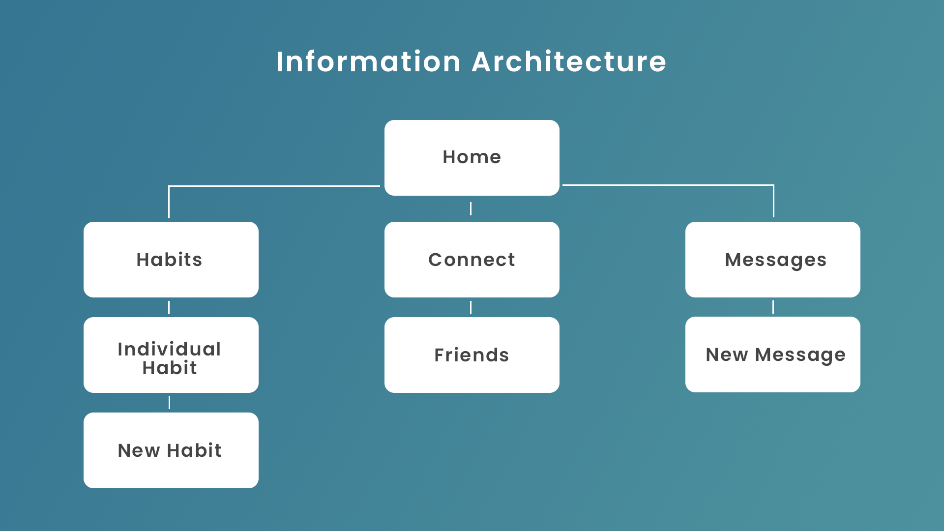
I began with an online survey, to gauge user interest and identify key features, then created a needs analysis to determine market fit. Once I had a clear picture, I moved on to information architecture and initial wireframe sketches. After seeking user feedback, I made low-fidelity mockups to ensure aesthetics didn’t distract from usability. After applying UI design to those mockups, Habi went through usability testing. The findings from that testing influenced features and information architecture in the final design.
As I began the process of developing a user flow, the most important features were the habit tracker and data visualization. Making sure that users were able to intuitively navigate these features was central to Habi’s success.
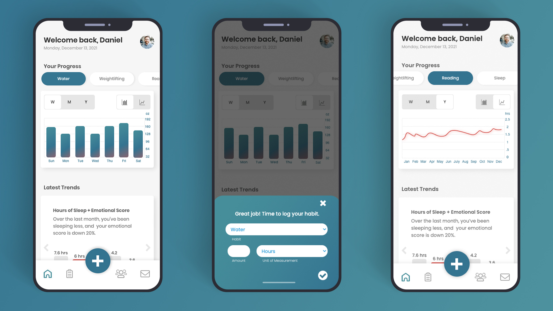
Initially, I saw these being two pages, a home page with habit tracking and a second page with graphs to show user data. However, through testing it became clear that centralizing all of these features on the home page would provide the greatest ease of use.
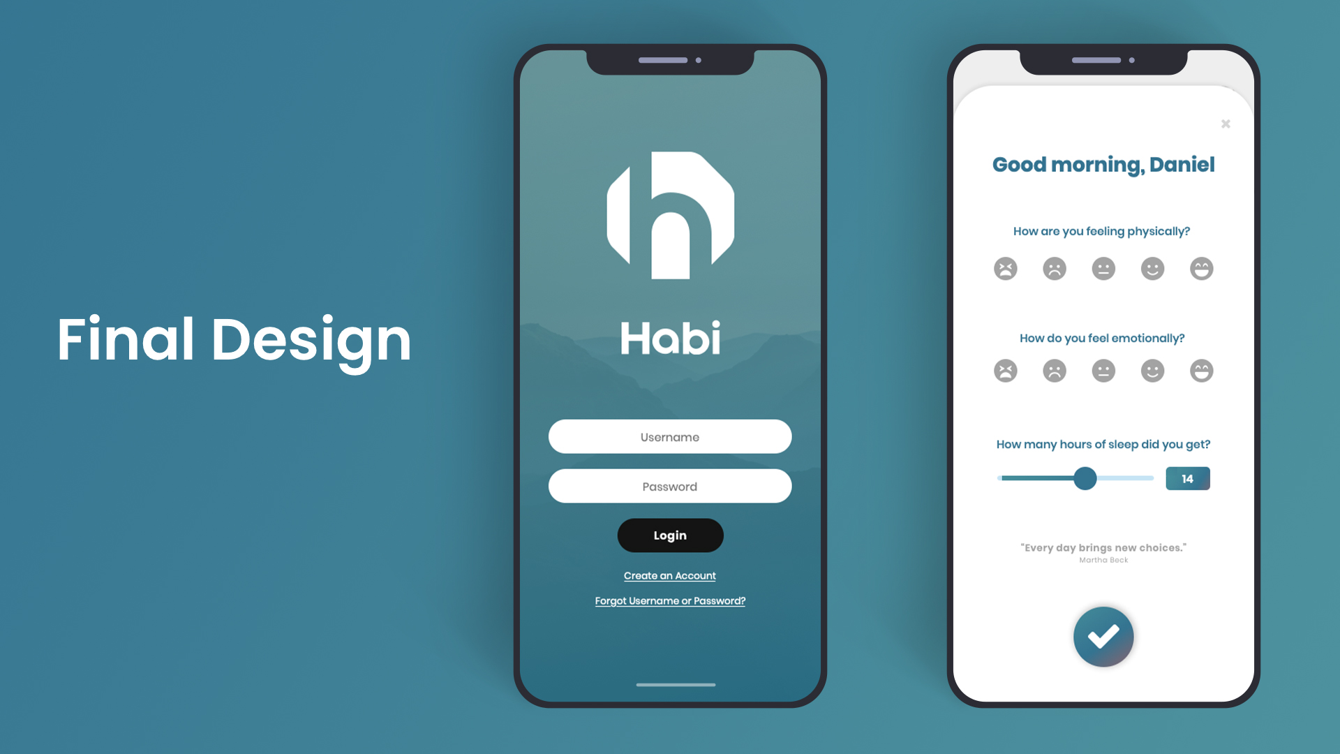
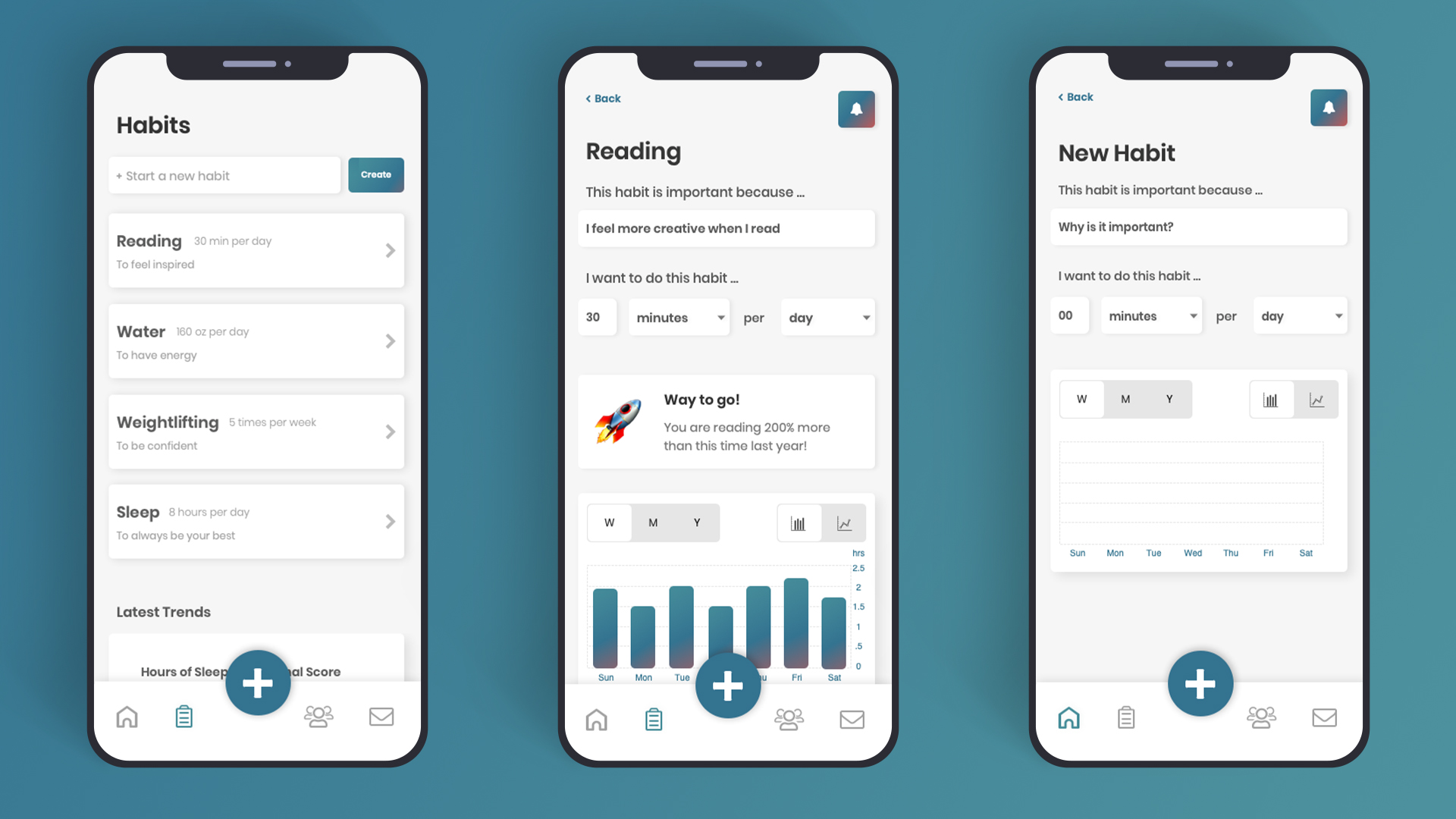
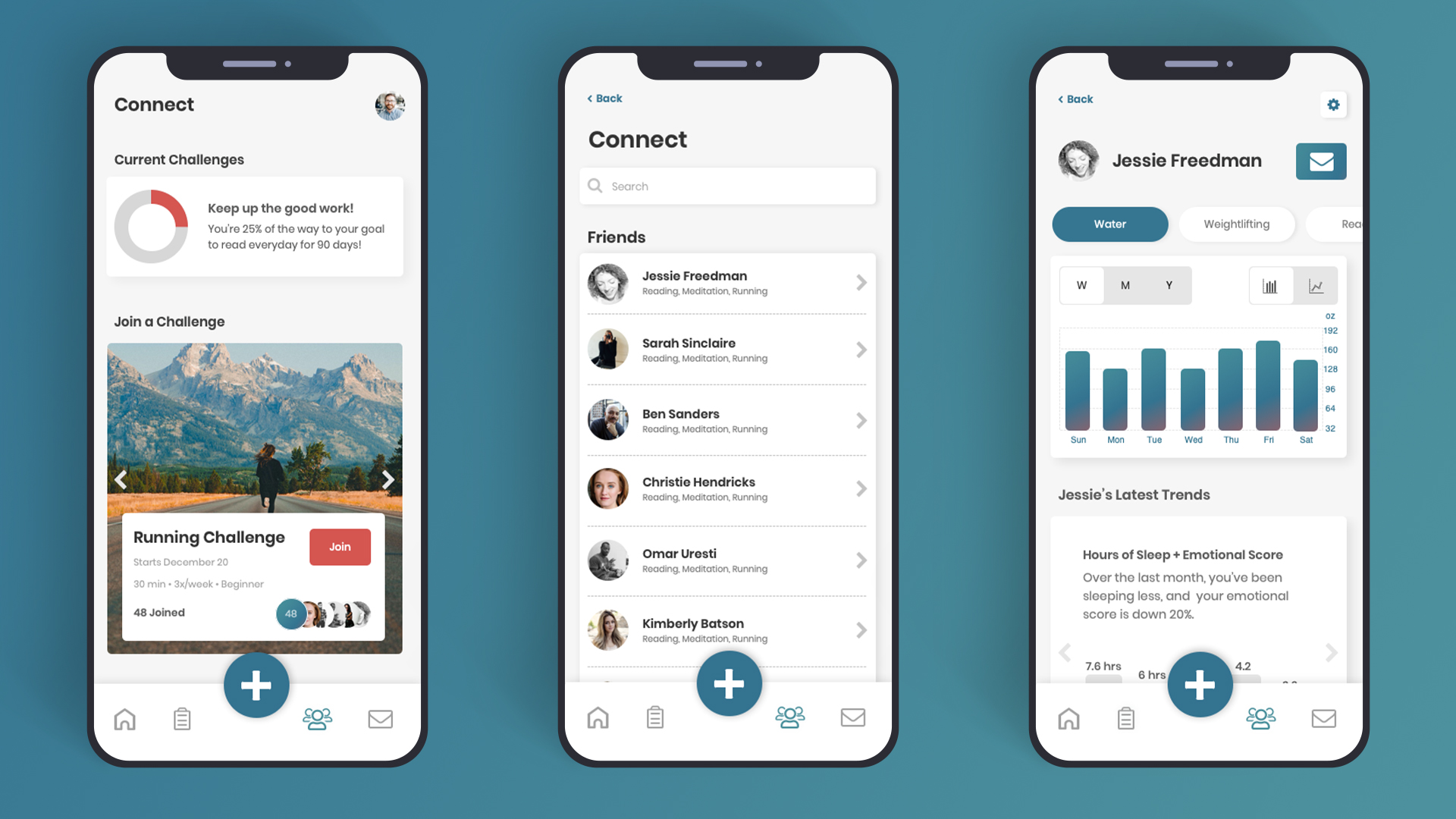
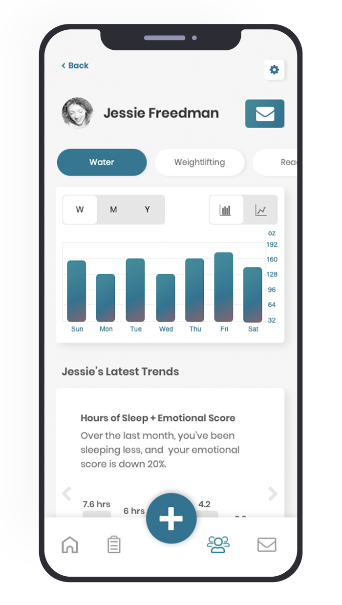
The daily wellness quiz (used to gather qualitative wellness data unavailable from wearables and other apps) became a pop-up when the app was launched each morning. Habit tracking was added to the menu bar, accessible from any page. And the graph data (which users can filter by time range and change between bar and line graphs) was placed in the primary position on the home screen.


