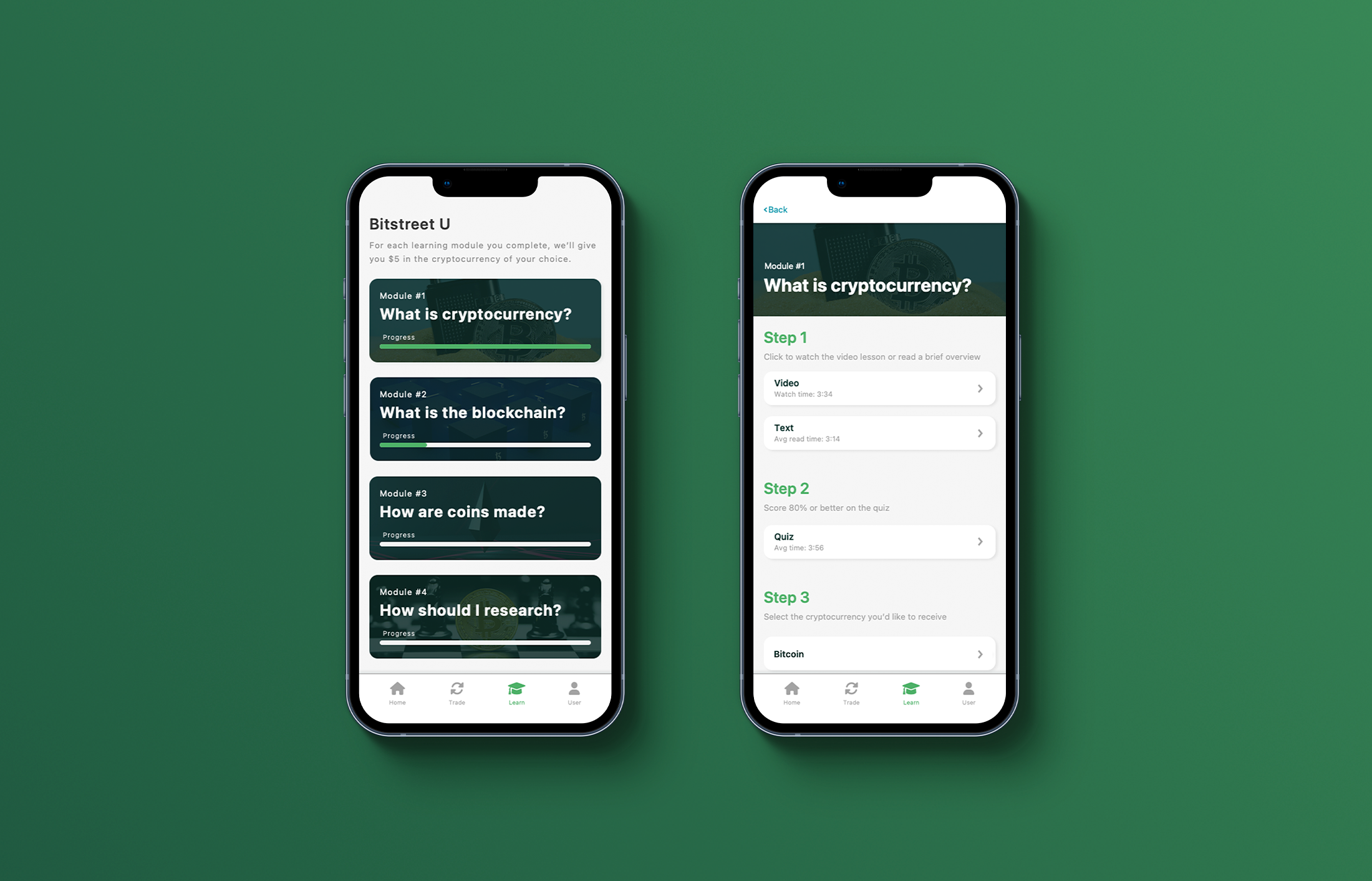
Many cryptocurrency platforms use jargon and overly complicated transaction processes, making the learning curve for the crypto curious unnecessarily steep. If cryptocurrency is going to gain widespread appeal, it must simplify its user experience.
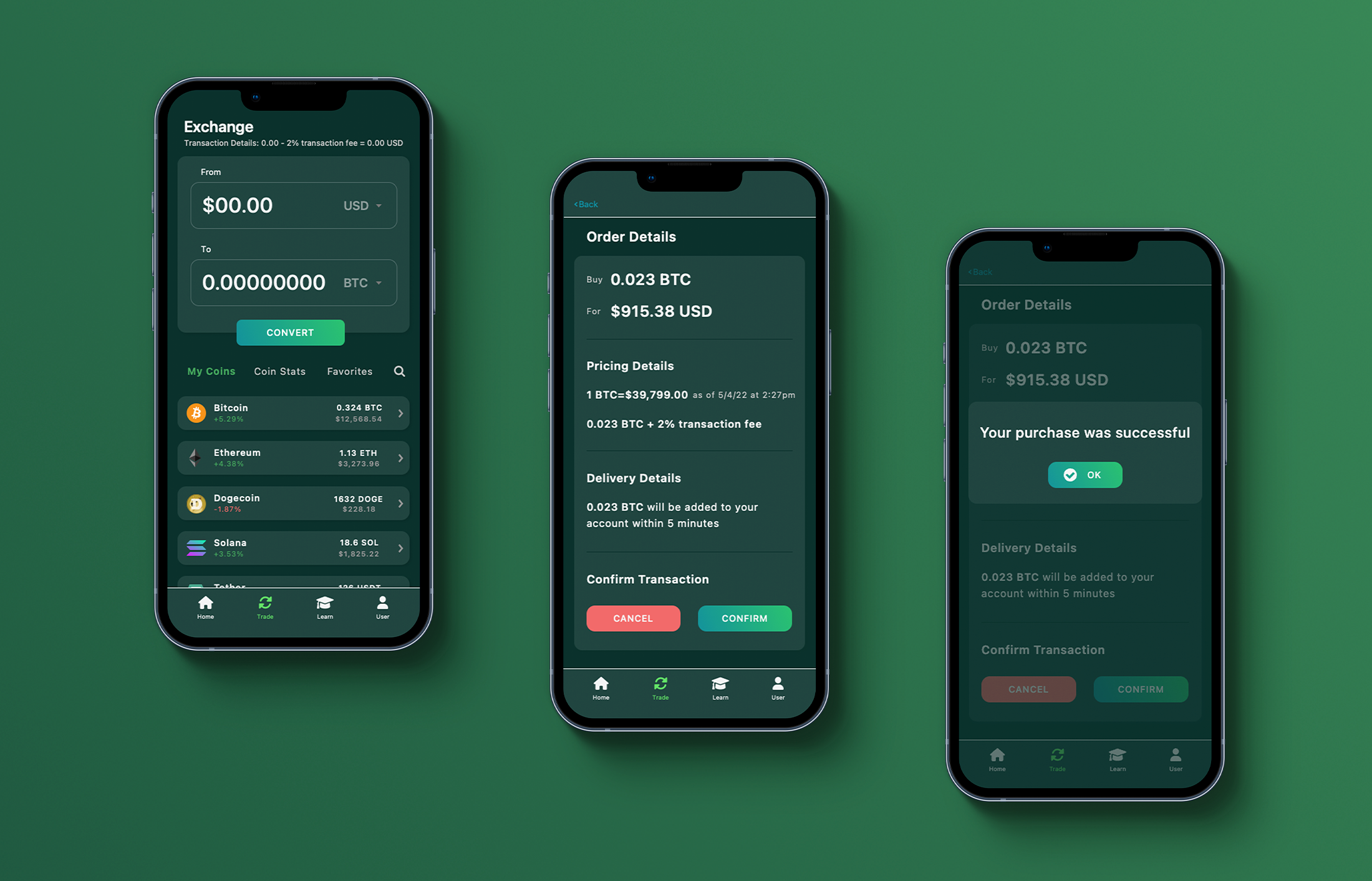
Bitstreet is a platform built on quick transactions, transparent pricing structures, and simple transfers to outside wallets. The experienced crypto user will appreciate its simple, secure exchange platform, while the new user will enjoy the familiar terminology and design structure.
Bitstreet required a mixed-method approach to user research. While surveys were a good way to collect data from people across the crypto spectrum, in-person interviews provided a better opportunity to learn from experienced blockchain users. Though these advanced users were not representative of all users, their feedback was crucial to creating a secure and comprehensive platform.
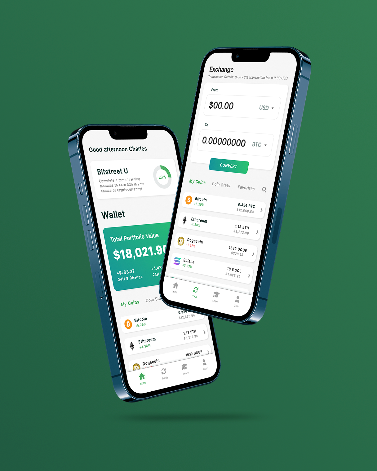
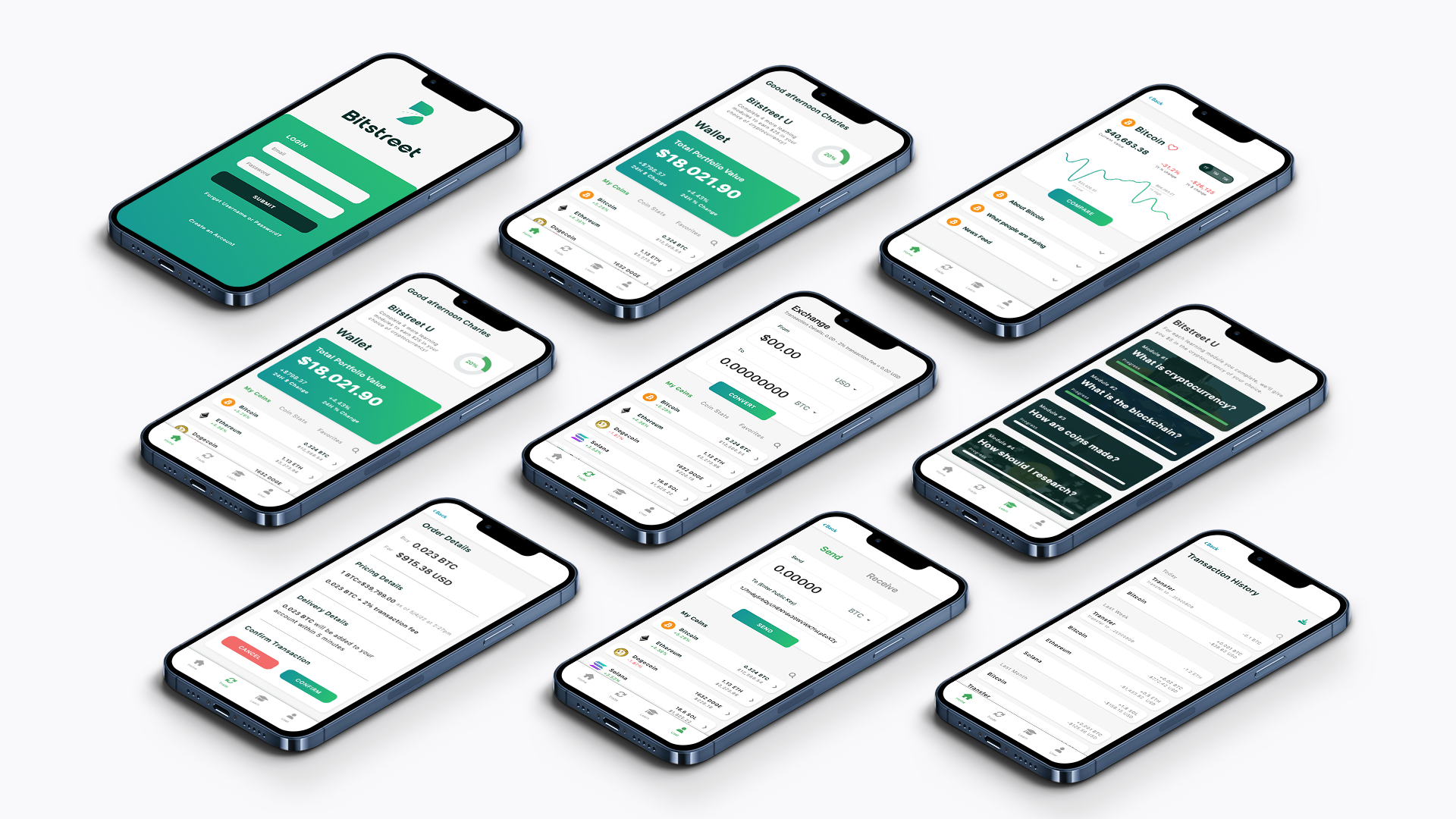
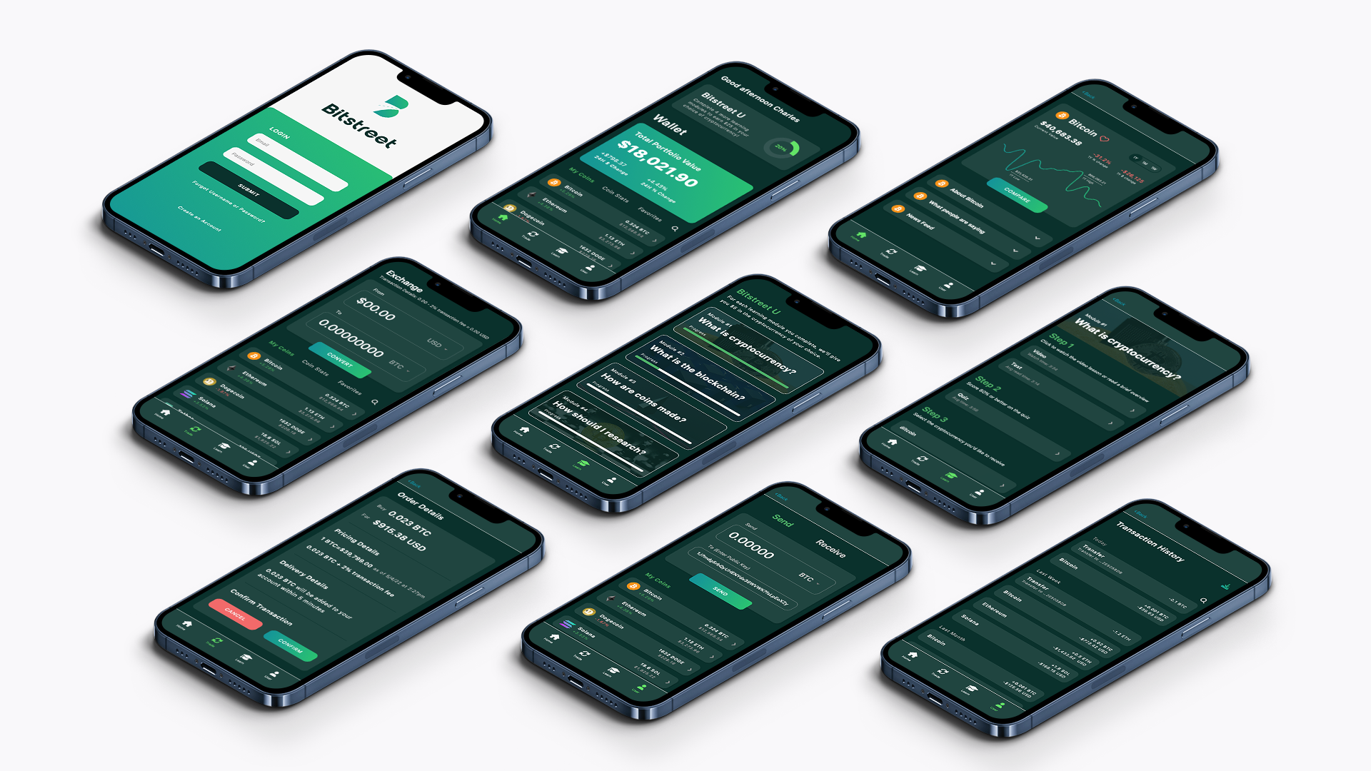
Dark mode is the standard for platforms web 3.0 platforms. Light mode, however, provides a better experience for users with visual impairments.
To prioritize accessibility over aesthetics, light mode is the standard interface for new users, but to give users customizability and conform to industry standards, dark mode is only a click away.
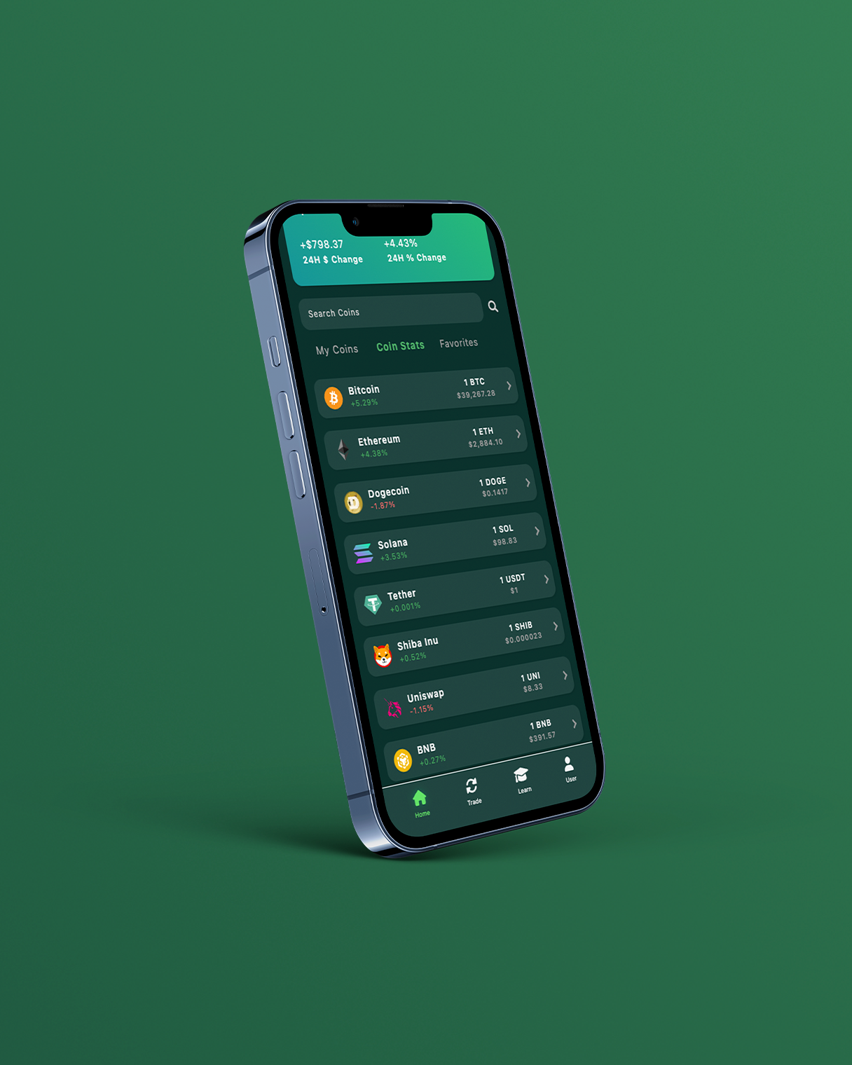
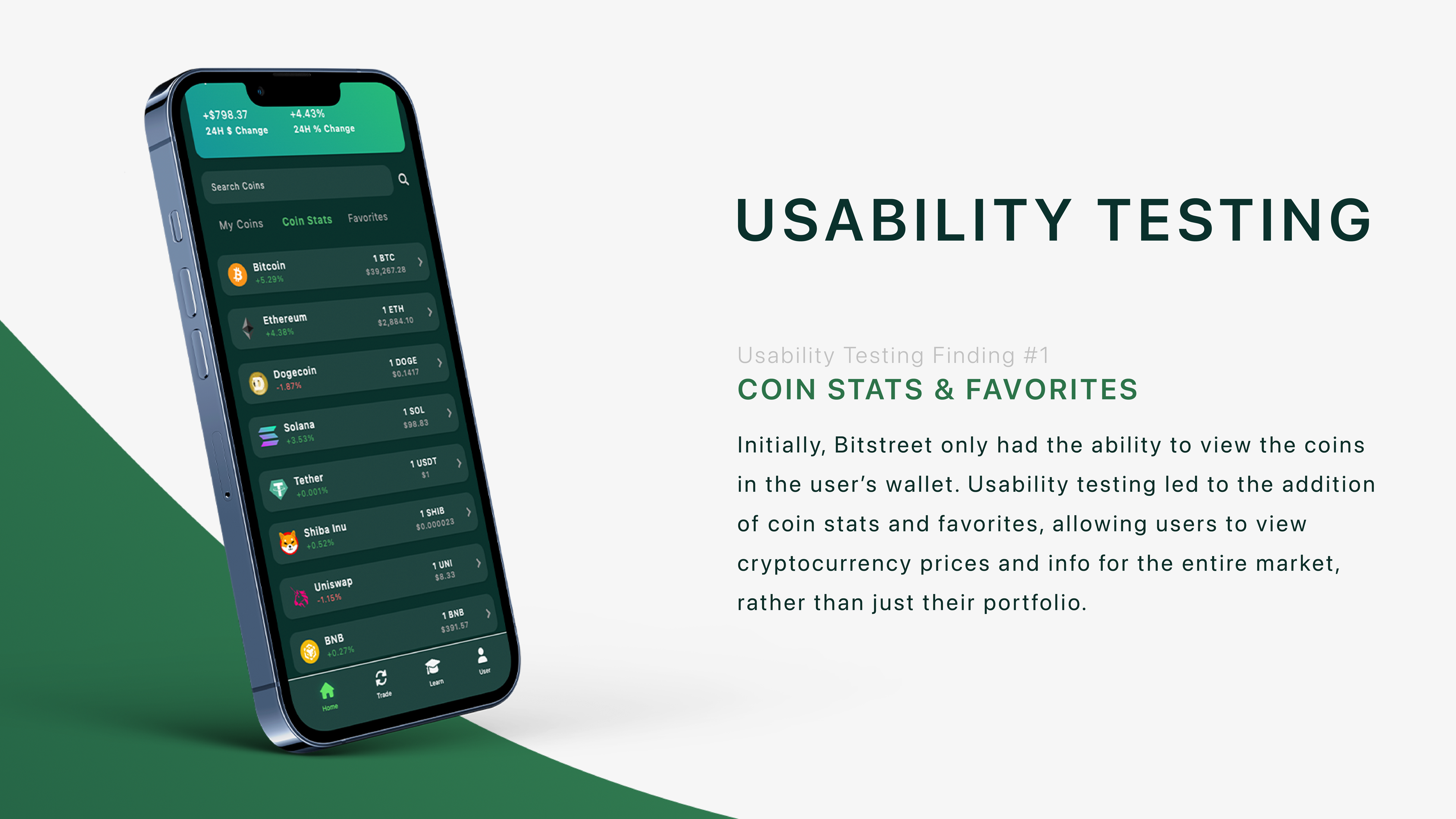
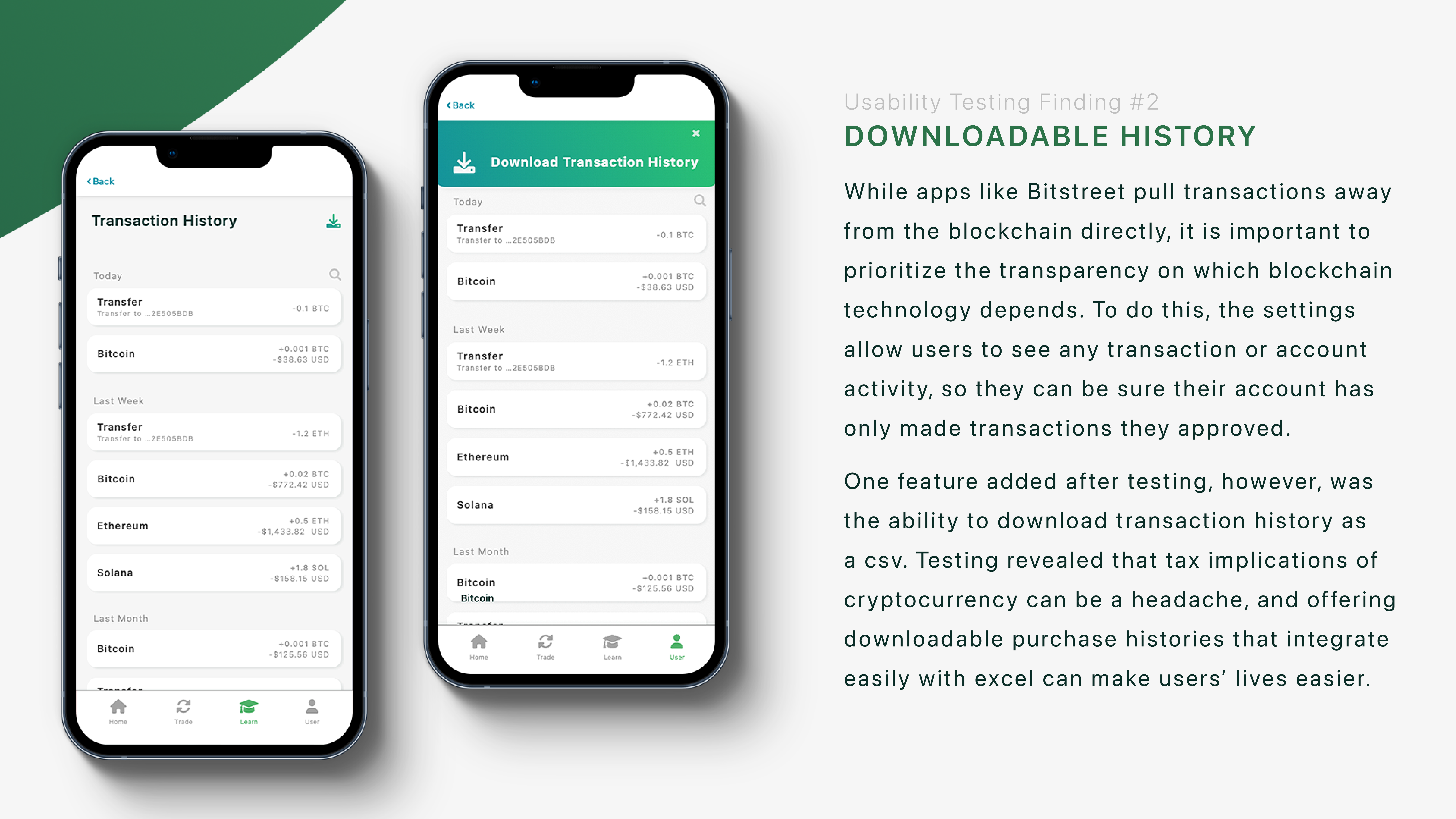
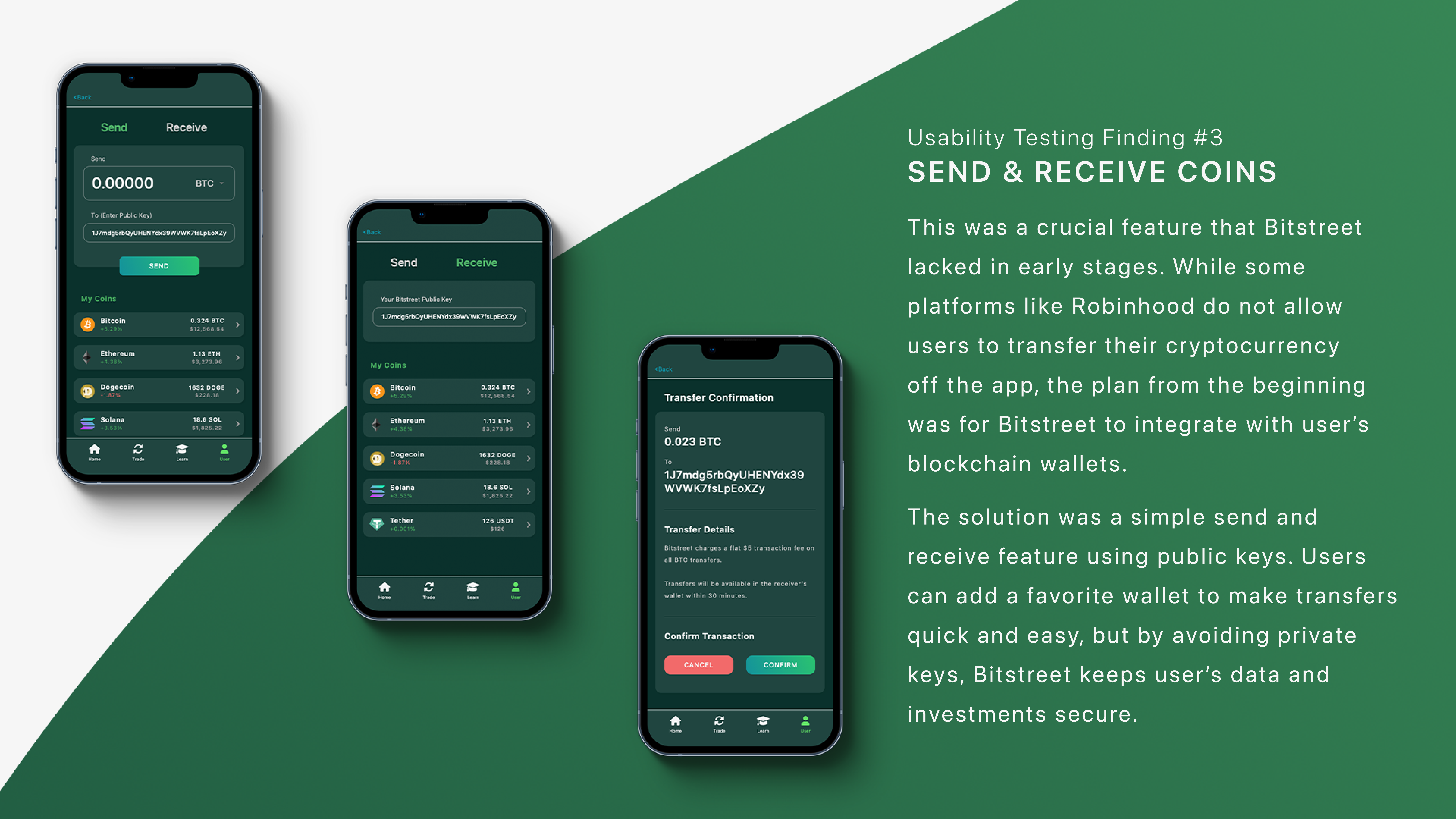
Through usability testing, we added a coin stats and favorites feature, allowing users to see market trends for all coins (instead of only those in their wallet). We also added a downloadable history, making it easier than ever for users to comply with federal tax regulations. Finally, user testing revealed a serious problem: there was no way to transfer coins out of the app. To make transfers to other wallets easy, Bitstreet uses public keys, keeping user’s private information safe.


